
Are You Ready For Google's 2017 Mobile SEO Updates?
You may remember part one of Google's mobile search ranking updates that were implemented in 2015 to favor websites with mobile friendly, responsive content. Now the other foot is set to drop mid January and has many marketers and online retailers scambling to ensure their rankings don't take a hit. So is your website prepared for what many are calling Google's Mobilegeddon Part Two? Here's a quick review of changes to expect.
Use of Interstitials or "Pop Ups" on mobile can result in lower ranking if they obscure underlying content. See examples below. Check your site's mobile experience to make sure you are avoiding pop-ups that obscure content.
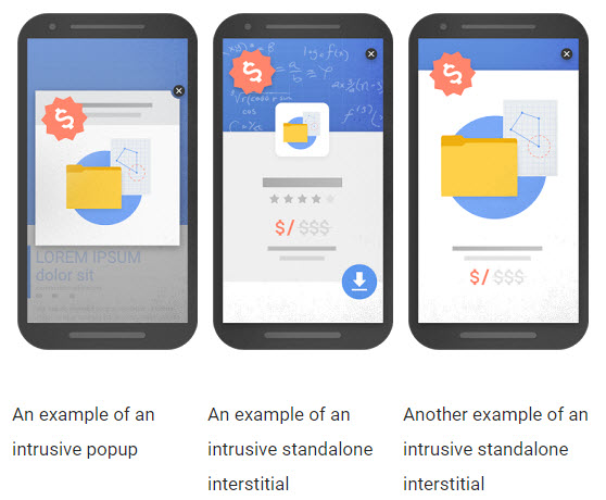
Source: Google Webmaster Central Blog.
Here's the official explanation from Google’s Webmaster Central Blog.
- Showing a pop-up that covers the main content, either immediately after users navigates to a page from the search results, or while they are looking through the page.
- Displaying a standalone interstitial that the user has to dismiss before accessing the main content.
- Using a layout where the above-the-fold portion of the page appears similar to a standalone interstitial, but the original content has been inlined underneath the fold.
What other factors effect your mobile search rankings?
Mobile Friendly Content: Your website should display the same content for desktop and mobile, so websites that are responsive or adaptive and implemented according to Google's standards will receive a higher ranking. Websites that to not optimize for mobile or use a separate mobile site with either duplicate or excluded content could be ranked lower in mobile search.
Mobile Site Performance: Poor load time for mobile can result in a lower ranking due to accessibility and poor user experience. Websites should utilized optimized images and code to improve performance. Use of AMP or Accelerated Mobile Pages has become another approved method for improving performance and search accessibility. Media intensive sites should also consider serving images, video and other resources from an optimized CDN or content delivery network such as Amazon S3, Rackspace Cloud Files, Microsoft Cloud or one of the other CDN providers with global reach.
Schema Markup continues to be an important method for allowing search networks efficiently and accurately read and, tag and rank content. Help Google do a better job understanding your content and they will reward you with better rankings. More about Schema Markup is available at Schema.org.
Test and Optimize: Google has developed tools to help test your website's "mobile-friendliness". The Mobile-Friendly Tool will crawl any web page url that you enter and analyze it, returning a green light or a list of items that violate Google’s mobile guidelines. More information on your site’s mobile status is also available in Google’s Search Console in the Mobile Usability Tool.
For additional assistance, contact Cyber-NY for a review of your website's mobile friendliness and compliance to Google's 2017 mobile search updates.
Related Posts